
…and data-flow diagrams, use-case diagrams, state-transition diagrams, and the like haven’t yet made you turn into a rabid wolf at the merest mention of such things, have one, courtesy of Gateway Pundit, developed by three Oregon scholars to decloud what the SJWs mean when they invoke various of their cant phrases:
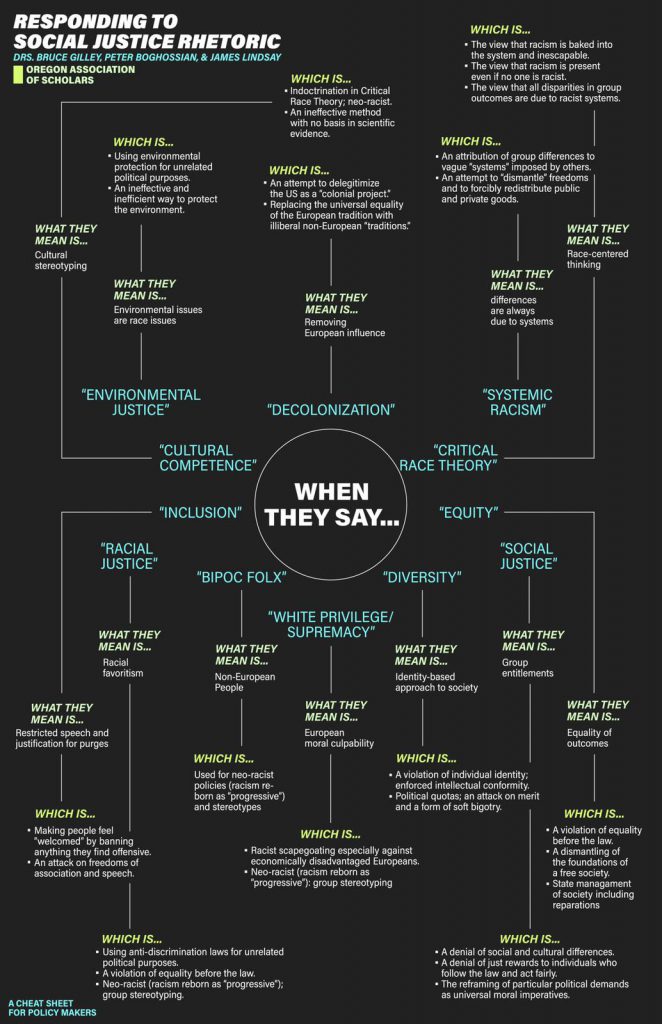
This is a brilliant piece of work. It takes a little effort to follow it – the origin is in the middle rather than at the top – but once you catch on, it’s as illuminating as anything I’ve seen in this space. I heartily recommend that you save it somewhere you won’t lose track of it.
Sorry, that’s all for now. I have 1,037 chores to complete (by actual count) before my new cleaning lady gets here. Can’t have the place looking dirty when she arrives!


5 comments
Skip to comment form
When they say “gentrification” — what they mean is “only deplorables restore rundown housing.” Which is another way •to force people into decrepit “sustainable” housing where they may be better controlled •to deplete the reserves of the middle class.
That could have been some simple text. That graphic is huge with tiny text; I had to zoom it and then pan around to read it.
Probably looks fine on someone’s 48″ 4K display, though.
Author
Well, them’s the breaks. Feel free to compose your own, highly informative and massively useful graphic!
I’m really enjoying some of the changes here. Glad you added in Nitzakhon to the mix.
@Linda: Thank you for the compliment!